Ever seen a badge on a car and had no clue who made it? You’re not alone. With dozens of brands using circles, shields, and animals as their symbols, it’s easy to mix them up. This guide breaks down 50 car logos by shape and style so you can spot them in seconds.
- Why do car logo shapes matter so much?
- Which car brands use animals in their logos?
- What are the most common circular car logos?
- Which brands rely on shield-shaped logos?
- How do luxury brands use logos differently?
- How are EV brands changing their logos?
- Which brands skip symbols and use just their name?
- What's the fastest way to identify an unfamiliar car logo?
- Bottom Line
Quick Snapshot: Logo Shapes at a Glance
- Circles: BMW, Audi, Toyota, Mercedes-Benz
- Shields: Chevrolet, Ford, Porsche, Volkswagen
- Animals: Ferrari, Lamborghini, Peugeot, Jaguar
- Wordmarks: Honda, Kia, Hyundai (newer versions), Tesla
This guide is based on publicly available brand logos and official company statements at the time of publication.
Why do car logo shapes matter so much?
Shapes help your brain recognize a brand faster than words do. A circle feels stable and premium, which is why BMW, Mercedes-Benz, and Toyota all lean on round badges. Shields suggest strength and heritage, which explains why Ford, Chevrolet, and Porsche stuck with them for over a century. Automakers pick shapes on purpose because drivers notice silhouettes long before they read any text.
Which car brands use animals in their logos?
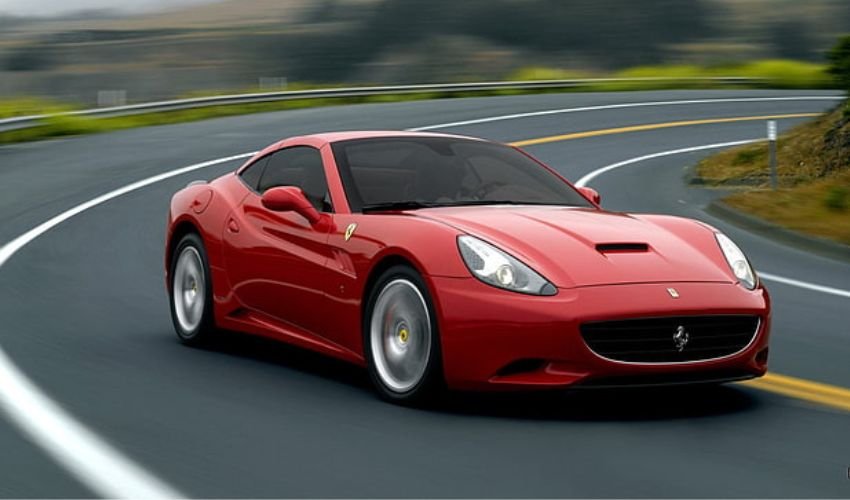
Several brands use animals to signal speed, power, or elegance. Ferrari’s prancing horse and Lamborghini’s raging bull both scream performance, while Peugeot’s lion and Jaguar’s leaping cat lean more into heritage and grace. Porsche also sneaks a horse into its crest, a nod to the city of Stuttgart’s own symbol.
Animal Logo Cheat Sheet
- 🐎 Ferrari, Porsche (horse)
- 🐂 Lamborghini (bull)
- 🐆 Jaguar (leaping cat)
- 🦁 Peugeot (lion)
What are the most common circular car logos?
Circular badges dominate the industry because they look clean on a grille and scale well across sizes. BMW’s blue and white circle represents Bavaria’s flag colors, not a spinning propeller as the myth suggests. Audi’s four interlocking rings stand for the four companies that merged to form the brand in 1932. Toyota uses three overlapping ovals to represent the hearts of the customer, the product, and progress.
| Brand | Logo Shape | What It Represents |
|---|---|---|
| BMW | Circle | Bavarian flag colors |
| Audi | Four rings | Merger of four companies |
| Mercedes-Benz | Circle with star | Dominance on land, sea, and air |
| Toyota | Three ovals | Trust between company and customer |
| Chevrolet | Bowtie | Disputed origin, possibly wallpaper design |
Which brands rely on shield-shaped logos?
Shield logos are common among brands with a long manufacturing history. Volkswagen’s VW monogram sits inside a circle but has shield-like roots from its 1930s design. Porsche’s crest combines a shield with the Stuttgart horse and state symbols. Ford’s blue oval isn’t technically a shield, but it carries the same sense of permanence that shield logos aim for.
How do luxury brands use logos differently?
Luxury automakers tend to favor minimalism and symmetry over flashy colors. Rolls-Royce uses the Spirit of Ecstasy hood ornament alongside a simple double-R monogram. Bentley pairs its winged \”B\” with a sense of old-world craftsmanship. Lexus keeps things understated with a stylized L inside an oval, avoiding bright colors entirely. The goal across these brands is to look timeless rather than trendy.
How are EV brands changing their logos?
Electric vehicle brands are moving toward flatter, simpler designs that work well on digital screens and apps. Tesla’s minimalist \”T\” was built for a tech-first audience from day one. Legacy brands like Kia, Nissan, and Renault have flattened their logos in recent years to look more modern and screen-friendly. Volkswagen also simplified its badge in 2019, dropping the 3D chrome look for a cleaner, two-dimensional design ahead of its EV push.
EV Logo Trends to Watch
- Flatter, 2D designs replacing chrome and 3D effects
- Simplified wordmarks over complex emblems
- Logos designed to glow or light up on EV models
- Brighter, tech-inspired color palettes
Which brands skip symbols and use just their name?
Several brands rely purely on typography instead of symbols. Honda uses a stylized \”H\” on most cars but leans on plain wordmarks in marketing. Hyundai redesigned its logo to look sleeker for its EV lineup, while Kia switched to a bold, slanted wordmark in 2021 to mark its shift toward electric models. Wordmark logos work well for brands trying to look modern and tech-forward rather than traditional.
What’s the fastest way to identify an unfamiliar car logo?
Start with the shape, then narrow down by color and any symbols inside it. If you see an animal, think performance or heritage brands like Ferrari, Lamborghini, or Peugeot. If you see a plain wordmark with sharp angles, it’s likely a newer EV-focused brand or a legacy automaker’s updated design. A quick photo and reverse image search also works in a pinch if you’re still stuck.
Bottom Line
Car logos aren’t random. Every shape, color, and symbol is chosen to say something about the brand’s history or direction, especially as automakers shift toward electric lineups. Once you know the patterns, from circles for stability to animals for speed, spotting a badge on the road becomes second nature.