Car badges tell a story before you even read the brand name. Some logos have barely changed in a century, while others are being redrawn right now to look better on a phone screen or an EV grille. Here’s a breakdown of 50 car brands, what their logos actually represent, and how electric vehicles are changing the game.
- What Do Common Car Logo Shapes Mean?
- Which Car Brands Use Animal Symbols?
- How Are EV Logos Different From Traditional Car Badges?
- Which Car Logos Are Circular, Shield-Shaped or Wordmarks?
- Why Do Car Brands Redesign Their Logos for Electric Models?
- Which Car Brands Share Similar Logo Colors?
- What Are 50 Notable Car Logos Worth Knowing?
- Bottom Line
Car Logo Snapshot
Brands Covered
Common Logo Shapes
Brands With Animal Symbols
Brands With Flattened EV Badges
This guide is based on publicly available brand assets, trademark filings and official automaker press materials at the time of publication.
What Do Common Car Logo Shapes Mean?
Most car logos fall into one of six categories: circles, shields, ovals, wordmarks, geometric marks or pictorial symbols. Circular badges like Mercedes-Benz’s three-pointed star or BMW’s roundel are built for 360-degree visibility on a hood or grille, which is why they’ve survived largely unchanged for decades. Shield shapes, used by Porsche and Ferrari, borrow from European heraldry and were originally meant to signal regional pride, Stuttgart for Porsche and Modena for Ferrari. Oval badges, like Ford’s and Chevrolet’s older marks, were popular in early American automotive branding because they were simple to cast in metal. Wordmarks, think Toyota’s older scripts or Subaru’s name badge, prioritize legibility over symbolism. Geometric marks are the newest trend, favored by EV-first brands that want something abstract and scalable. Pictorial symbols, like Peugeot’s lion or Lamborghini’s bull, lean on storytelling instead of shape.
Which Car Brands Use Animal Symbols?
Animal logos are some of the oldest branding tools in the industry because they instantly communicate a trait, speed, power or agility, without needing a single word. Ferrari’s prancing horse was reportedly inspired by a World War I fighter pilot’s personal emblem and later gifted to Enzo Ferrari by the pilot’s mother. Lamborghini’s raging bull reflects founder Ferruccio Lamborghini’s love of Spanish bullfighting and his own zodiac sign, Taurus. Peugeot’s lion dates back to the 1850s and was originally used on saw blades before becoming a car badge. Other animal-branded automakers include:
- Porsche, which combines a horse with the Stuttgart coat of arms
- Mustang (Ford), with its running horse emblem
- Alfa Romeo, featuring a serpent devouring a man, tied to Milanese folklore
- Spyker, with its propeller and Latin motto surrounded by wings
These symbols work because they don’t need translation. A bull means aggression everywhere, not just in Italy.
Logo Shape Breakdown
How Are EV Logos Different From Traditional Car Badges?
EV and EV-first brands tend to favor flat, minimal marks because their badges live on screens, apps and charging networks, not just metal grilles. Tesla’s stylized T, Rivian’s compass-inspired R, Lucid’s wave-like mark and Polestar’s star all skip the 3D chrome finish that older automakers relied on. Even legacy brands are following suit. Volkswagen flattened its logo in 2019, Nissan went flat with its 2020 redesign, and Kia rolled out a completely new signature-style logo in 2021 to signal its EV push. Cadillac dropped its traditional wreath in 2021 to leave just the crest, a cleaner look meant to fit its electric Lyriq and Celestiq lineup. The shift isn’t cosmetic alone, flat logos scale better across digital dashboards, mobile apps and small badge placements on EV charge ports.
Which Car Logos Are Circular, Shield-Shaped or Wordmarks?
Here’s a quick comparison of how some of the best-known brands format their badges, which helps explain why certain logos feel more premium or more utilitarian at a glance.
| Brand | Logo Format | Primary Symbol | Country of Origin |
|---|---|---|---|
| Mercedes-Benz | Circular | Three-pointed star | Germany |
| BMW | Circular | Roundel (blue/white quarters) | Germany |
| Audi | Geometric | Four interlocking rings | Germany |
| Ferrari | Shield | Prancing horse | Italy |
| Peugeot | Pictorial | Lion | France |
| Toyota | Oval | Three overlapping ovals | Japan |
| Tesla | Geometric | Stylized T | United States |
| Jeep | Wordmark | Seven-slot grille | United States |
Audi’s four rings are a good example of a logo with practical origins rather than symbolic ones, each ring represents one of the four companies, Audi, DKW, Horch and Wanderer, that merged in 1932 to form Auto Union.
Why Do Car Brands Redesign Their Logos for Electric Models?
Automakers redesign logos for EVs mainly to signal a clean break from combustion-era identity. A flatter, simpler badge suggests technology and forward motion rather than heritage and mechanical engineering. Renault’s 2021 diamond redesign, for instance, dropped its chrome finish for a sleek, monochrome look timed with its EV rollout. Hyundai introduced a separate sub-brand logo, the slanted N for performance EVs, to separate its electric identity from its traditional lineup. Even brands that keep their core symbol, like Chevrolet’s bowtie, are flattening the finish and simplifying the proportions so the mark works as well on a phone screen as it does on a hood.
Which Car Brands Share Similar Logo Colors?
Blue and silver dominate the industry because they signal trust, precision and a premium feel without being flashy. Ford, Volkswagen, Hyundai and Subaru all lean on blue tones in some version of their badge. Red, on the other hand, is the go-to for performance branding, seen in Ferrari, Alfa Romeo and Toyota’s old script logo. Green is rarer but shows up in brands with British heritage, like Aston Martin and Land Rover, often tied to racing colors from early 20th-century motorsport. Black and white minimalism has become the signature look for EV-first brands like Tesla, Rivian and Lucid, largely because it’s cheaper to print, easier to animate digitally and looks sharp on a dark dashboard interface.
Color Trends Across Brands
Ford, VW, Hyundai, Subaru
Ferrari, Alfa Romeo, Toyota (legacy)
Aston Martin, Land Rover
Tesla, Rivian, Lucid
What Are 50 Notable Car Logos Worth Knowing?
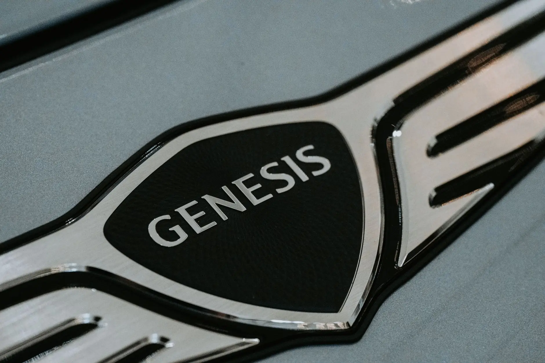
Here’s a condensed list covering legacy automakers, performance brands and EV newcomers worth recognizing on sight: Mercedes-Benz, BMW, Audi, Volkswagen, Porsche, Ferrari, Lamborghini, Maserati, Alfa Romeo, Fiat, Peugeot, Renault, Citroen, Toyota, Honda, Nissan, Mazda, Subaru, Mitsubishi, Lexus, Infiniti, Acura, Ford, Chevrolet, Cadillac, Buick, GMC, Chrysler, Dodge, Jeep, Ram, Hyundai, Kia, Genesis, Volvo, Jaguar, Land Rover, Aston Martin, Bentley, Rolls-Royce, Mini, Skoda, Seat, Tesla, Rivian, Lucid, Polestar, BYD, NIO, Xpeng and Fisker. Each one reflects a different era of automotive branding, from hand-painted crests to app-ready pixel marks.
Bottom Line
Car logos aren’t just decoration, they’re a quick read on a brand’s history, country of origin and, increasingly, whether it’s chasing an electric future. Shields and animal symbols point to old-world craftsmanship, while flat geometric marks signal a brand built for screens and software. Next time you spot a badge you don’t recognize, check the shape first, it usually tells you more than the name does.